Conservation Up Close: Introduction to Etchings and Other Intaglio Techniques
- Fenna Engelke

- Jul 20, 2023
- 6 min read
Updated: May 1


Images: (1) A screenshot from the MFA Boston's website about the Conservation up Close session (2) Top Center, Photo showing Fenna Engelke explaining engraving to the audience (3) Top Right, Fenna Engelke showing an example of dry point to the audience (4) Bottom Center, examining pieces in the paper conservation library (5) Bottom Right, The Conservation Up Close session all set up, before the talk started.
With the opening of the Conservation Center at the MFA Boston, the conservation staff was invited to participate in some of the regular programming focused around conservation. The themes could be very broad, and as a fellow, I was encouraged to apply. The result was two ‘Closer Looking’ Sessions with the public focused on the introduction of intaglio techniques. (Which took place on February 23rd and March 23rd). I was able to choose the objects that the public could view during my session and designed the 30-40 minute talk alongside a flier that the participants could take with them. The following post is a synopsis of the information provided at the event, along with additional information about the pieces I chose to discuss .
Content and Setup

I wanted to have as much public interaction as possible, so alongside the prints, I also had a table set apart from the art. This table included some of my own prints as well as copper plates and magnifiers, which members of the public can touch and feel before moving on to look at the objects.
When choosing prints to show the public, I attempted to have examples of multiple intaglio techniques. I tried to get a variety of artists and get a few niche examples as well.


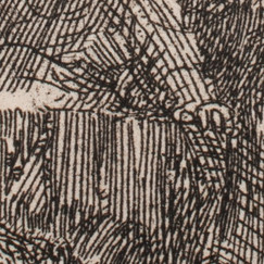
Image: (7) Adoration of the Shepherds by Hendrick Goltzius’, overall, P7217 (8) Adoration of the Shepherds by Hendrick Goltzius’, overall, P7216 (9-10) Details from Adoration of the Shepherds by Hendrick Goltzius, P7216 (11) The copper etching plate for The Raising of Lazarus by Rembrandt (12) The Raising of Lazarus by Rembrandt (13-14) Details from The Raising of Lazarus by Rembrandt
For engravings, I chose two states of Adoration of the Shepherds (1617) by Hendrick Goltzius (1558-1617) .
There were a few reasons for choosing this print. Along with Goltzius’ work being a great example of engraving, having two versions of the image also allows me to introduce the concepts of ‘states’ to the audience and talk about the intaglio printmaking process. I find it is also rare to see an unfinished intaglio print on display for the public to view, so I felt that showing these pieces could give a visual example of how a printmaker would work and plan out a piece.
For etching, I had to bring out Rembrandt (1606-1669). The MFA Boston is lucky to have two intaglio plates from Rembrandt, and so I decided to choose a print that related to one of the plates in the collection. While The Raising of Lazarus (1642) is not my favorite print from Rembrandt, having the chance to see a print next to its original printing plate is a bit of a treat. It also helps that the recognizable name of Rembrandt always draws some attention from the general public who join the closer looking sessions. I had the pieces themselves displayed for people to view, but I also had the detail images seen above (Images 9-10, 13-14) on an iPad to better show the line quality and the differences between an etched and engraved line.


So far, I had brought out two old master prints, but for the rest of the talk, I wanted to move forward in time a bit. When introducing dry-point, I brought out a later print. La Modiste (The Milliner) by Théophile-Alexandre Steinlen (1859-1923) was introduced to me by one of the Prints and Drawings curators for a very particular reason.
La Modiste (The Milliner) (1898) uses a dry-point technique, resulting in the creation of burrs made from the copper being moved on the plate. What is unique about this piece is that the burrs on the plate were so severe that the resulting print has little punctures in the paper from the burrs. I have never seen anything like this (please contact me if you have seen anything similar), and so I find this a phenomenal piece to look at, as it is such a rare find.


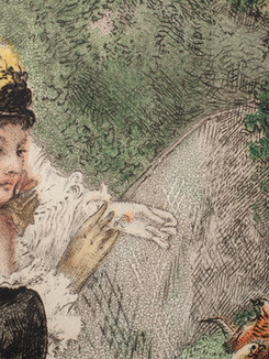


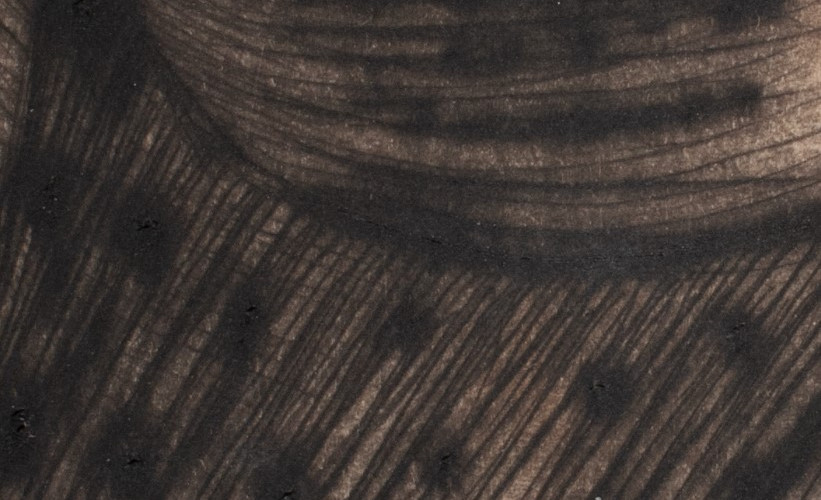
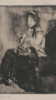
Image: (19) In the Omnibus by Mary Cassatt, overall, recto (20-21) Detail images from In the Omnibus by Mary Cassatt (22) At the Zoological Gardens by Felix Bracquemond, overall, recto (23 - 26) Detail images from At the Zoological Gardens by Felix Bracquemond
I had a few things I wanted to show when it came to introducing aquatinting. Along with showing the technique, I also wanted to show a lot of color intaglio prints. I think that because of the prevalence of black ink prints, there is an assumption that intaglio is not done in color. I wanted to show a few great pieces in our collection that show off the possibilities for color intaglio prints. For this reason, I pulled two prints. One is Mary Cassatt’s In the Omnibus. Mary Cassatt’s intaglio work is a marvelous example of what can be done with intaglio while working in color. There’s also a very Japanese-woodblock quality to her printed work, created by the use of strong blocks of color and pattern work. The second print I pulled to show aquatinting was Félix Bracquemond’s At the Zoological Gardens which similarly uses a multi-plate, multi-color technique. Bracquemond’s work is an exploration of what can be done with intaglio printing and was even shown in the same exhibit as some of Mary Cassatt’s work at one time. The aquatinting in the print At the Zoological Gardens, has a larger pattern which is easier to see by the viewer. This rosin pattern from the aquatinting in the print, therefore, makes it a great example for the closer-looking session. There’s also a slight registration issue with the print, which allows for discussion about registration and about the process of doing a multi-plate printing technique in intaglio.


Images: (27) The Umbrella from Mary Cassatt, overall, recto (28-29) Detail images from The Umbrella from Mary Cassatt (30) Drawing for The Umbrella, by Maty Cassatt, overall, recto (31) Verso of the Drawing for The Umbrella. The verso of the drawing shows remains of softground on the paper, showing that Cassatt drew from the drawing directly onto the soft ground.
When talking about soft ground, I brought out another Mary Cassatt print, The Umbrella. While I do love Mary Cassatt’s work, I didn’t necessarily want more than one piece from Cassatt in the lecture. That being said, I decided to use this work because the MFA also has the corresponding drawing for this piece. The great thing about the drawing is that it has soft-ground on the back of the paper, showing how Cassatt used her drawing to impress into the soft-ground and create the resulting print. Having these two objects was such a great way to look into an artist's working methods while introducing the technique of soft-ground.


The last intaglio technique I wanted to talk about was mezzotint. Created by first ‘rocking’ the plate with the rocker tool, the plate would then be burnished to create a beautifully toned image, achieving great fields of blacks when printed. These prints take quite a lot of time to create and when mezzotinting had its hay-day it was used extensively to create portraits.
In this case, however, I wanted to move away from the historical portraits and chose to show the more modern image of From an Office Window by Christopher Richard Wynne Nevinson (1889-1946). This allowed us to view less traditional imagery while also seeing the texture created by the rocker on the plate.
Almost, but not included


One of the prints I had wanted to include was St. Catherine by Jacob Christoph Le Blon (1667-1741) as an example of the mezzotint technique, as well as another example of color intaglio printing. Le Blon’s intaglio work is a great show of what is possible with color intaglio printing. His work, along with others, was part of a great effort by many artists at this time to create realistic color imaging for publications, particularly for the recreation of paintings. Le Blon applied the three-color, and sometimes four-color, method to mezzotint plates; a concept that many of us are familiar with thanks to photography and modern CMY printing, but done before its time.
In the case of St. Catherine, the paper has been cut down to the image, losing the plate marks. This was likely intentional to obscure any evidence of misregistration or stray ink. The reason why this method didn’t take off might have to do with how extremely time consuming and therefore expensive it must have been to create such images for publication. All the same, the prints that resulted are amazing in their use of color and scale. The print at the MFA, St. Catherine, is their only Le Bon print, but it is also quite large in size, measuring 61.3 x 44.7 cm (24 1/8 x 17 5/3 inches). The size posed an issue to transport and show to the public and so I decided not to include it for these sessions but if given an opportunity to do this lecture again, I would love to give the public an opportunity to see it in person.
Bibliography and Further Reading
Images:


Comments